Recent Articles
Popular Makes
Body Types
10 Best Cars With Digital Dashboards
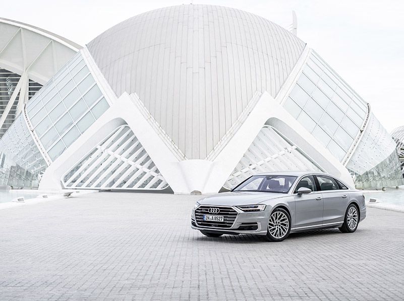
2019 Audi A8 hero ・ Photo by Audi
Digital dashboards have been with us for decades, and their evolution has followed the arc of other digital advances. For example, compare Fortnite to Pong, and you’ll get a good idea of how far we’ve come. Through the years we’ve seen some weird and truly awful attempts at digital dashes. Many were more flashy than functional, and they irritate to this day. In contrast, the best of today’s digital dashboards make accessing information easy and intuitive. They enhance the driving experience rather than frustrating it. That’s why this list is dominated by current vehicles rather than oldies-but-goodies.
The art has advanced rapidly. A current trend is to use multiple screens, some of which are multi-configurable, others of which are dedicated to a single function such as climate control. Then there is the Tesla Model 3, which doesn’t have a traditional instrument panel at all, handling information delivery in a wholly different way. Here are the 10 best cars with digital dashboards.
1. 2019 Audi A8
The 2019 Audi A8 luxury sedan pushes the envelope of the digital dash in an impressively functional direction. Many digital displays emphasize the cute or the quirky, making the point that they are “modern” but being strange. The A8's designers, on the other hand, achieved real modernity by conceiving ways to convey more information digitally. It begins with a sizable and configurable full-color display right in front of the driver, easily visible through the steering wheel.
A map pinpointing the car’s position can be the dominant graphic on this screen, while the car still makes room for critical information like speed, gear selection, and engine revolutions. Meanwhile, a 10.1-inch touchscreen display features a smartphone-like menu structure that's intuitive and easy to navigate. Feature icons can be arranged according to personal preferences, and the system can store up to seven profiles.
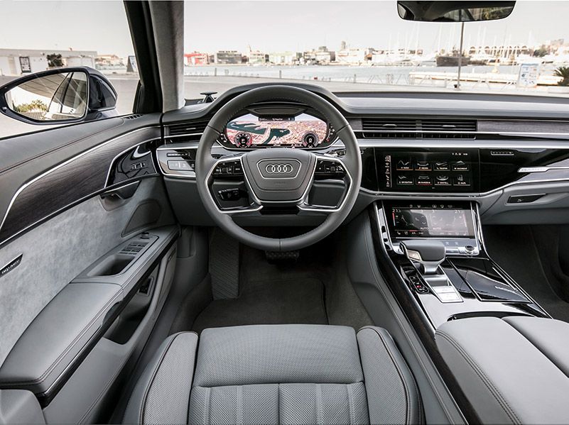
Photo by Audi
2. 2018 Mercedes-Benz S-Class
The Mercedes-Benz S-Class puts the equivalent of two movie screens side by side to form its instrument panel array. Both 12.3-inch color displays deliver information in high resolution. Their 8:3 format is a bit unusual, but think “Panavision” in motion picture terms.
The lefthand display performs the functions of a traditional instrument cluster, providing the driver with as much vehicle information as the driver desires. Typically, it mimics the “two round dial” format that graces so many conventional instrument clusters, but it does it with vivid hi-res graphics instead of mechanical instruments. The righthand display provides infotainment and comfort functions. Navigating this screen takes some getting used to. The carousel-style on-screen menus respond to the movement of a console-mounted rotary knob, but the operation proves logical with practice.

Photo by Mercedes-Benz
3. 2018 Tesla Model S
The Tesla Model S electric car has been highly praised for many aspects of its design and driving experience, but its digital instrument panel and driver-machine interface have been particularly eye-catching trend-setters. Tesla transformed what an instrument panel should and could be, and it set the stage for advances like we see in the 2019 Audi A8.
The Model S dash is actually deceptively simple. One reason for that is that electric vehicles have relatively few parameters to monitor. There's no coolant temperature, oil temperature, or engine revolutions. The Tesla panel features a central round modular display. The information conveyed by that display changes depending on the state of the vehicle. When driving, the center circle displays speed, power meter, charge level, estimated range, and the currently engaged gear. When parked, the center circle displays estimated range and the status of doors. When plugged in, the instrument panel displays state of charge and other charging information.
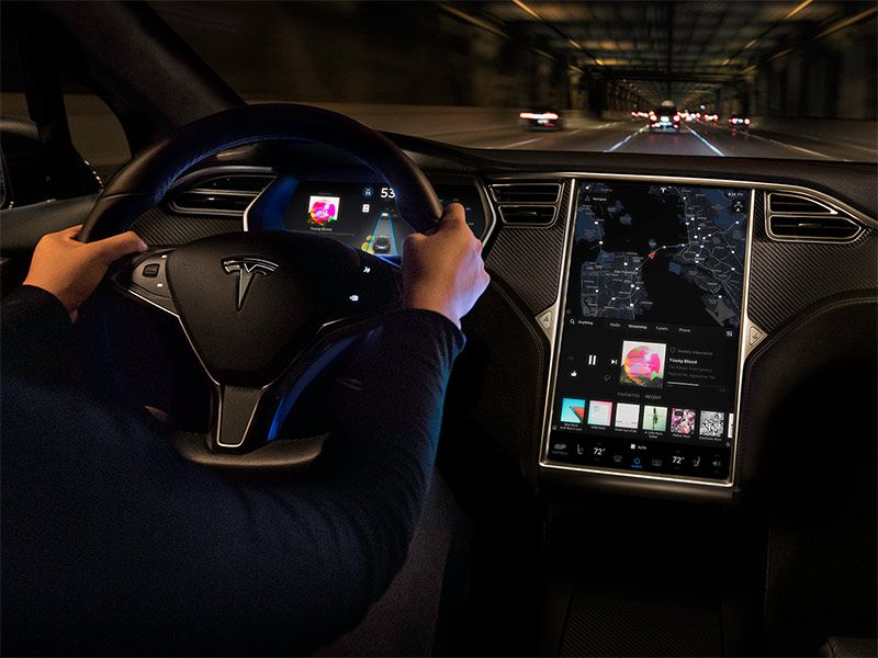
Photo by Tesla
4. 2019 Honda Clarity Fuel Cell
Newer-than-tomorrow vehicles like those powered by hydrogen fuel cells are certainly deserving of future-tech digital dashes. That is one of many areas in which the new Honda Clarity Fuel Cell sedan doesn’t disappoint. Up top in its own little pod is a big digital speedometer. It’s almost a head-up display without projection.
Below it is a three-dimensional display of hydrogen consumption, battery levels, motor output, and other key information in a format almost like a video game. A centrally located ball-shaped H2 meter keeps track of hydrogen consumption. The ball changes color and size to reflect hydrogen usage as driving conditions change. During high consumption, the ball is large and amber-colored to suggest caution. As consumption decreases, it shrinks and turns yellow, then blue as consumption decreases further. The fuel cell stack's output gauge and battery output/charge display are on the perimeter of the display.
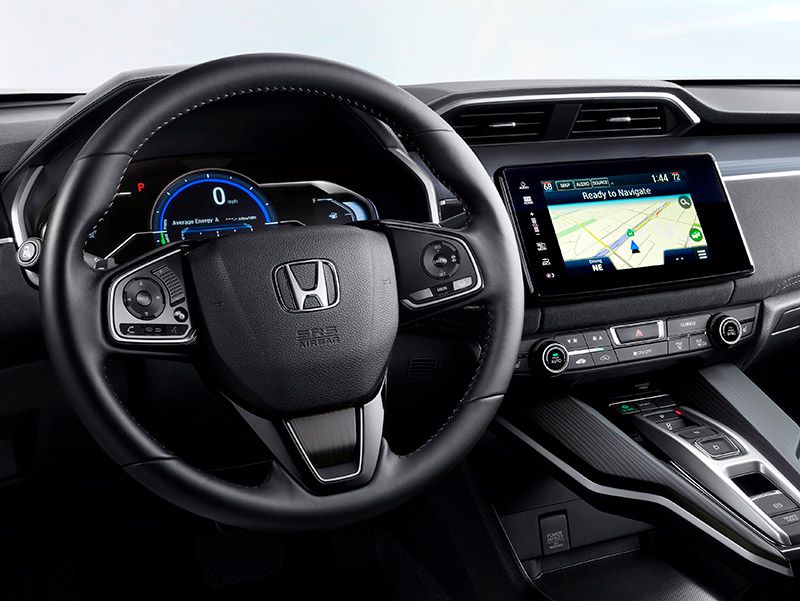
Photo by Honda
5. 2018 Chevrolet Volt
The Chevrolet Volt’s drive system is somewhat different than the typical plug-in hybrid electric vehicle in that its gasoline engine essentially never drives the wheels. But the Volt does share many attributes with other PHEVs, including an elaborate digital instrument panel.
Drivers can configure the instrument cluster's LCD screen in four ways. "Classic" is the simplest, displaying basic information on speed and range. "Classic Enhanced" adds depictions of driving efficiency and power usage. "Modern" features an “efficiency ring” that glows green to yellow based on driving behavior and offers basic information like speed and range. The most elaborate display, "Modern Enhanced," includes the “efficiency ring,” additional power usage information, and basic info like speed and range.
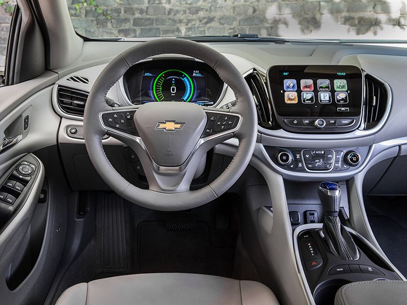
Photo by General Motors
6. 2019 Infiniti QX50
Designers of the new 2019 Infiniti QX50 crossover subscribed to the theory that if one display is good, two displays are better, three displays are better than that, and four displays are best of all. Starting from the top, the QX50 features a head-up display in the driver's line of sight, to show vehicle speed and warnings. The projector displays information on a 9-inch area on the windscreen that requires drivers to adjust their sightline by just four degrees.
Display number two is a screen between the speedometer and tachometer that offers driving information, safety messages, and a real-time display of the engine's power output and efficiency. The center of the dash is dominated by an 8-inch upper touchscreen, displaying essential information like navigation instructions. Lastly, a separate 7-inch lower touchscreen below it contains climate controls, apps, and entertainment functions.

Photo by Infiniti
7. 2018 Chevrolet Bolt EV
Drivers familiar with the Chevrolet Volt will find the Bolt EV's instrument panel very similar. But there are significant differences, and that’s logical given that the Bolt EV has no gasoline engine. Instead of the Volt’s choice of four themes, the Bolt offers just three.
"Classic" displays basic information on speed, range, and other operations along with an “efficiency bar” that glows green to yellow based on driving patterns. "Modern" displays basic information and power usage, but its most interesting feature is an “efficiency ball” that moves up and down based on driving efficiency. "Enhanced" displays basic information plus a maximum and minimum range indicator and power usage. It also offers an “efficiency ring” that glows green to yellow based on driving efficiency. Whether you view the bar, ball, or ring is up to you.
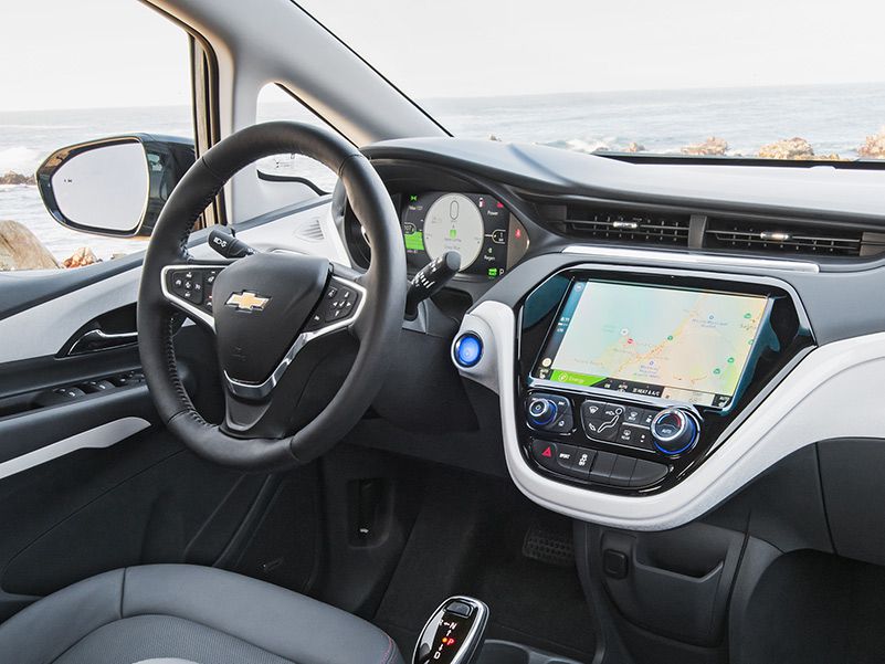
Photo by General Motors
8. 2009 Lamborghini Reventon
Supercar manufacturers are in a double bind when it comes to high-tech digital displays. Their bucks-up customers expect marques like Lamborghini to build cars with avant-garde graphics and displays matching their inflated price tags. But compared to high-volume carmakers, niche brands have relatively few personnel for to things like instrument panels. Even more difficult is the fact that most development work on a supercar can only be amortized over a handful of production vehicles.
So you have to give Lamborghini credit for the digital dash in its Reventon, despite the fact that some called it utterly baffling. The vehicle includes three digital displays that can be customized to show various information, including g-force, but the presentation is more jet-fighter than driver-friendly. Still, Lamborghini gets positive marks for trying.
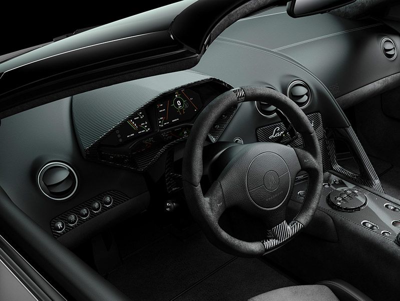
Photo by Lamborghini
9. 2018 Tesla Model 3
If the Tesla Model S led the way to the elaborate digital dashes we now see in most top-of-the-line luxury marques, the company's Model 3 is taking digital dash design a decidedly different direction. Yes, Tesla designers could have given us a display that aped the much-heralded Model S. Instead, they left the sightline right in front of the driver bereft of any instrumentation.
The Model 3 delivers rather minimalist info — vehicle speed, range, and forward-park-reverse selection — in the upper lefthand quadrant of the car’s central iPad-like display screen. Immediately below that area is an area that Tesla calls “Cards,” where you get updates like incoming calls, seatbelt reminders, and the current state of your windshield wipers. By swiping that area, you can access the rear-view camera display, your wipers, and trip information.
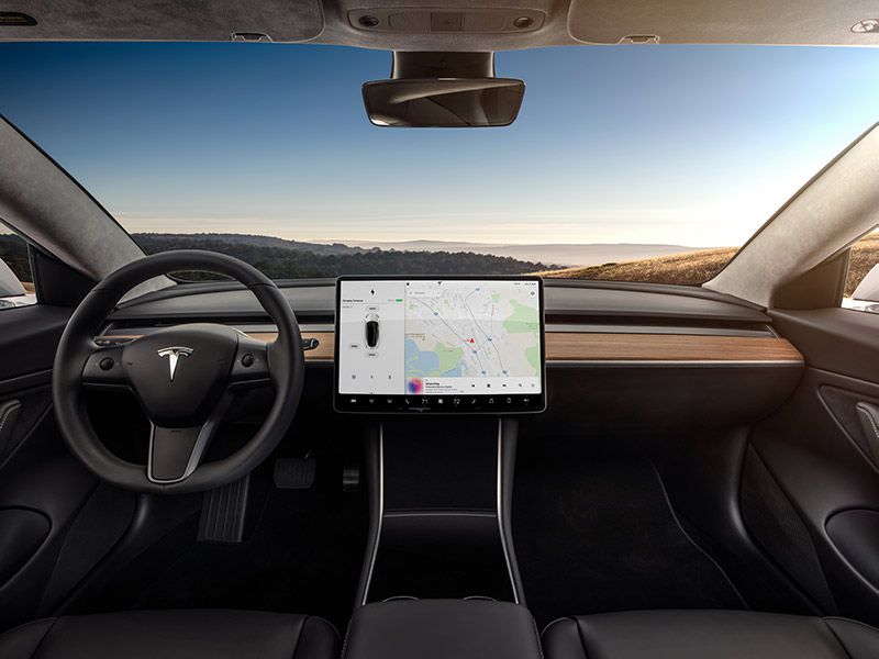
Photo by Tesla
10. 2016 Toyota Mirai
The Toyota Mirai fuel cell vehicle is designed to take us into the hydrogen future. Since it is an official car of the future, Toyota designers felt compelled to make certain that its instrument panel properly conveyed that the Mirai is not just another sedan. They succeeded mightily. Instead of a conventional round speedometer and tachometer pairing, the Mirai splits its instruments into three levels, none of which is immediately in front of the driver.
The top-level digital screen, slightly canted toward the driver, features a prominent digital speedometer with giant numerals. Odometer and fuel level also appear in that area of the upper screen. The middle area delivers information about the vehicle itself. The right-hand third of the upper display indicates whether the transmission is in drive, reverse, or park, and it also includes a clock. Below that display is a more traditional “center stack” rectangular display that can offer navigation or entertainment. The lowest screen serves the climate-control system.
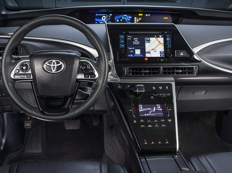
Photo by Toyota